Infographic Recommended: ChatGPT
Infographic: Planet Size Comparison
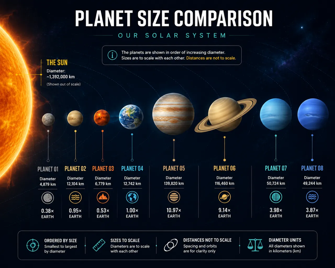
A solar-system comparison chart: planets scaled by size, orbit diagrams, and leader lines — the visual awe of cosmic scale.
Full prompt (English)
Educational astronomy infographic comparing the relative sizes of the solar system planets, the planets arranged in an ascending row from small to large with accurate scale to each other, the sun partially shown at one edge and drawn out of scale with a label, thin connector lines and small circular caption dots, deep space background with stars and faint orbital ring arcs, flat illustrative style, palette of orange Mars, blue Earth, tawny Saturn with rings, indigo Neptune, abstract placeholder labels to avoid garbled text, neat grid layout, high resolution, 4k
Recreate this:
Copy the prompt above → open ChatGPT → paste and send (you can switch the image model) → wait for the result.
Open ChatGPT ↗
For step-by-step details, see the
tutorial.
FAQ
How do I recreate this image?▾
Copy the English prompt above, open ChatGPT, switch to an image model, paste the prompt and send — the model will generate the same look.
Which AI tool should I use?▾
Recommended target: ChatGPT. Any conversational image tool that supports long English prompts can reproduce an approximate result.
Can I customize this prompt?▾
Yes — swap the subject, style, colors or composition words with your own. The description often points out typical swap points (e.g. “swap X for Y”).
Can I use the sample image freely?▾
The sample image was generated by us with this prompt for display only; the prompt itself is free to copy and use. For commercial use, follow the terms of your chosen AI tool.