Infographic Recommended: ChatGPT
Infographic: Candlestick Chart Explained
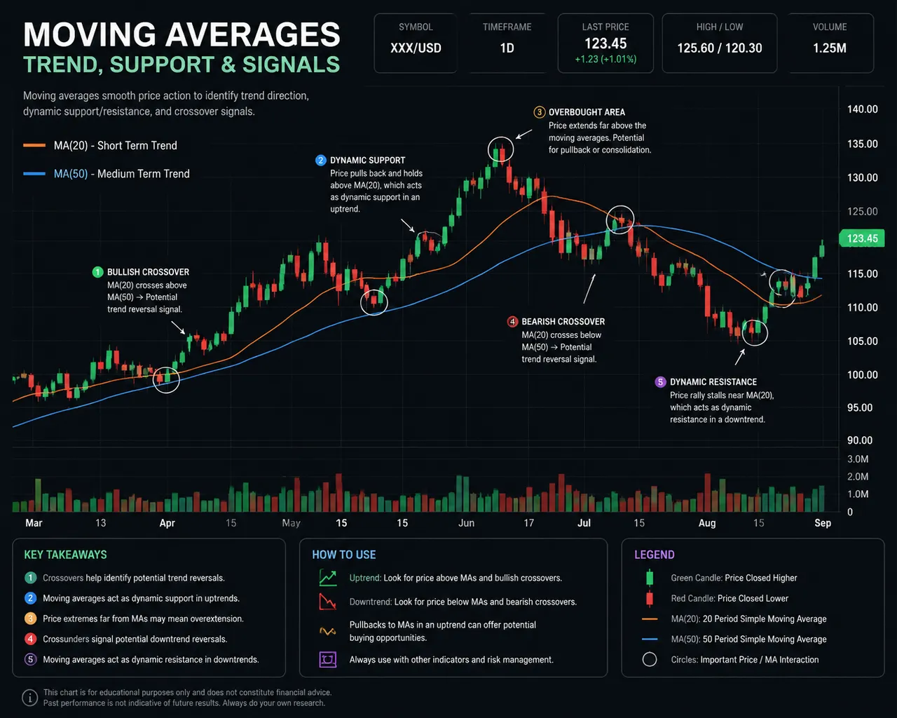
A stock candlestick explainer: red-green candles, moving averages, and annotation arrows — understanding up-and-down logic at a glance.
Full prompt (English)
Educational stock-chart infographic, a candlestick chart with alternating green up-candles and red down-candles, two smooth moving-average lines overlaid in orange and blue, important points circled with thin annotation arrows and small callout labels, abstract placeholder labels to avoid garbled text, dark slate panel background with grid lines, precise financial-data aesthetic, clear explanatory hierarchy, professional trading-desk mood, high resolution, 4k
Recreate this:
Copy the prompt above → open ChatGPT → paste and send (you can switch the image model) → wait for the result.
Open ChatGPT ↗
For step-by-step details, see the
tutorial.
FAQ
How do I recreate this image?▾
Copy the English prompt above, open ChatGPT, switch to an image model, paste the prompt and send — the model will generate the same look.
Which AI tool should I use?▾
Recommended target: ChatGPT. Any conversational image tool that supports long English prompts can reproduce an approximate result.
Can I customize this prompt?▾
Yes — swap the subject, style, colors or composition words with your own. The description often points out typical swap points (e.g. “swap X for Y”).
Can I use the sample image freely?▾
The sample image was generated by us with this prompt for display only; the prompt itself is free to copy and use. For commercial use, follow the terms of your chosen AI tool.